Dulux Colour of The Year 2024 Sweet Embrace
Oh dear! Dulux Paints have announced their Colour of The Year 2024 as Sweet Embrace, it’s a beautiful name….but it is actually a colour?
Autumn is the start of ‘Colour of The Year Season’ where influential brands announce what they predict will be the must-have colour in the following year. One that ‘captures the moment’ and is the colour that you need in your life right now.
What is Colour of the Year?
For a global colour authority like Pantone this colour reflects and connects with all aspects of culture. So it may be found in fashion, homewares and even pop culture related to a movie. For example, in 2023 Pantone chose Viva Magenta, a bold red-toned pink and we all know how popular pink became thanks to the Barbie movie.
For a paint brand the reasoning behind their Colour of the Year has a more direct commercial purpose. This is the paint colour they will champion to their customers with the intention of purchasing a product, in this case a pot of paint.
Therefore, it has to be sellable to the masses and it has to fit into their existing and future colour palette. Regular customers need to be able to associate the colour with the brand and it needs to fit into their lifestyle with ease.
At the same time, it’s also a huge part of their marketing strategy as it will appear across the brand’s campaign and position the brand as an expert – i.e. it will get people talking…yes, I’m guilty of that right now!
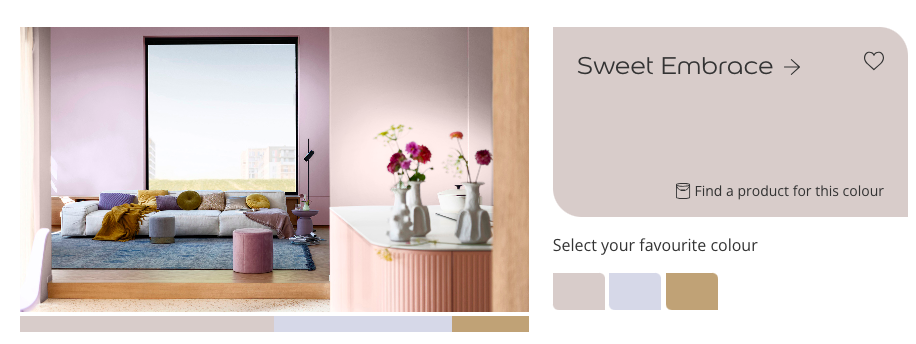
Dulux Colour of the Year Sweet Embrace
So let’s take a look at Dulux Colour of the Year Sweet Embrace – what does this colour represent, how will it feel to have this colour in your home and is it even a colour?
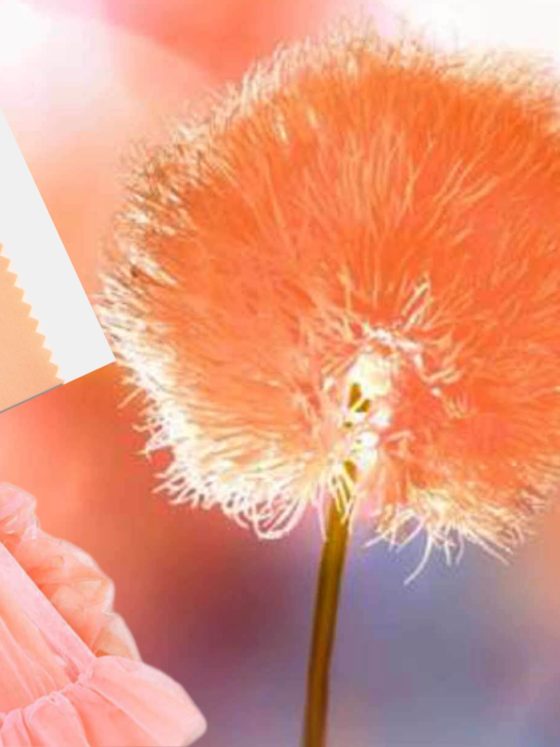
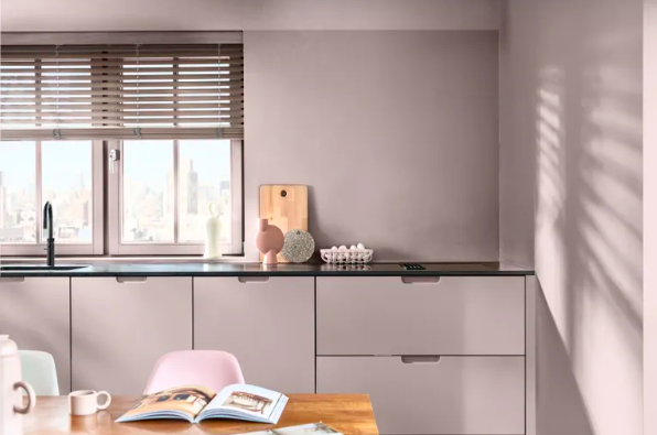
The colour is presented as a soft, peaceful pink, – it doesn’t have the uplifting energy of a classic baby pink, instead it’s a pink that’s been toned down with greyish, mauve elements. The most interesting observation about Sweet Mauve is that it changes depending on the light and therein lies the problem.
In Dulux’s official pictures it looks nice enough; a new colour (each year they invent and trademark a colour,) inoffensive and like a type of pink.
In other lights however, it looks beige – the ultimate colour of no colour at all.
Now this isn’t unusual. Lighting plays a huge impact on how we see and experience colours. It explains why in a shop you might find the denim jeans colour of your dreams, elevated by the store light’s colours but when you wear them outside in natural light they’re a whole different shade of blue.
So in marketing materials Dulux make Sweet Embrace look a certain way but it may not look that way when captured by others. Now this is not a philosophy of mine.
Is Sweet Embrace pink or beige?
Take a look at this Instagram video, a chat between the brand’s colour guru Marianne Shillingford and colour psychologist Karen Haller ….you can’t see a hint of pink – only beige.
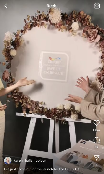
I know this was shot on a mobile phone without reliable lighting but the way life operates now with the existence and expansion of social media, how colours come across digitally is as important as how they look on your wall. The use of brown decor around the colour amplifies the beige tones too.
If a colour doesn’t come across as intended through a phone lens, does it really pass the test of time?
Dulux Colour of the Year 2024 Colour Palettes
Now, the average Dulux customer may not think of it in these digital terms and that’s because Dulux actually sell them a complete colour palette.
The paint giant doesn’t want you to only buy the Dulux Colour of the Year Sweet Embrace they want you to buy accompanying paint colours too.
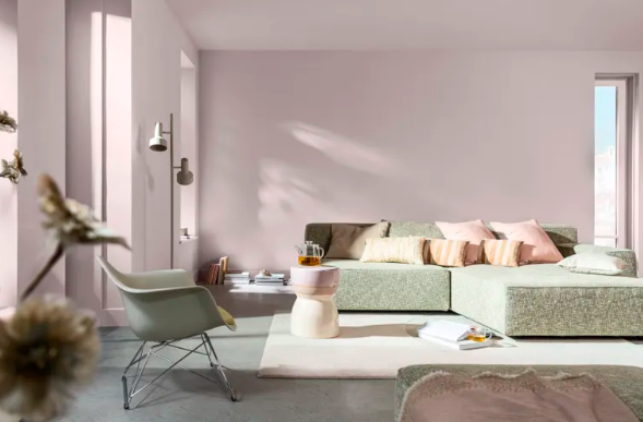
There’s a choice of a cool palette where Sweet Embrace is positioned with blues and greens and a warm palette where there are more earthy tones.
This is very intentional because just like under different lights, colours change how they appear when you position them alongside another colour. Many colour experts myself included believe that individual colours can look even better then they bounce off the energy of a different colour.
For example, I’m not a fan of grey. On its own I find grey to be dull and oppressive, but when grey is placed near a lilac, a blue, or even a soft pink it doesn’t look or feel as bad to me.
Similarly, when you position Sweet Embrace next to other Dulux colours it feels different. In order to enjoy this quality of the colour however, you need to purchase more paint, which equals more sales and more money in the bank for Dulux.
That’s how business works of course, but I cant help thinking if you’re going to choose a Colour of The Year why can’t it be a stand-alone colour that makes a statement by being itself: an individual. Why does it only work best with other colours, doesn’t that make it a secondary colour of the year?
How is the Dulux Colour of the Year paint chosen?
A video on the Dulux website explains that each year there is an annual trend forecast. They call it a ‘global brainstorm’ where they invite industry experts, forecasters, designers and journalists to contribute their ideas.
For Dulux Colour of the Year 2024 Sweet Embrace, the brand identified three feelings they wanted to capture with the colour:
*a feeling of belonging – (to give the you the comfort of feeling like you’re at home)
*connect with the need to simplify our lives – (this is to do with switching off from technology, encouraging you to look around, perhaps this is their interpretation of mindfulness)
*surrounding ourselves with light-heartedness (this means joy so I’m not sure they didn’t simplify the description and use the word)
From what you’ve seen of Sweet Embrace, and it’s early days as it was only announced yesterday, do you think the colour is successful in doing these three things?
I think the success and appeal of this colour will grow as we see it in more use. I would like to get my hands on a pot in real life to see how it looks in natural light and then artificial light as I think that will be a truer representation of it rather than seeing it online.
So for now, I’m not fully embracing Sweet Embrace just yet…but I’m keeping an open mind!
All images in this blog post are from Dulux, I do not own the copyright